Overview
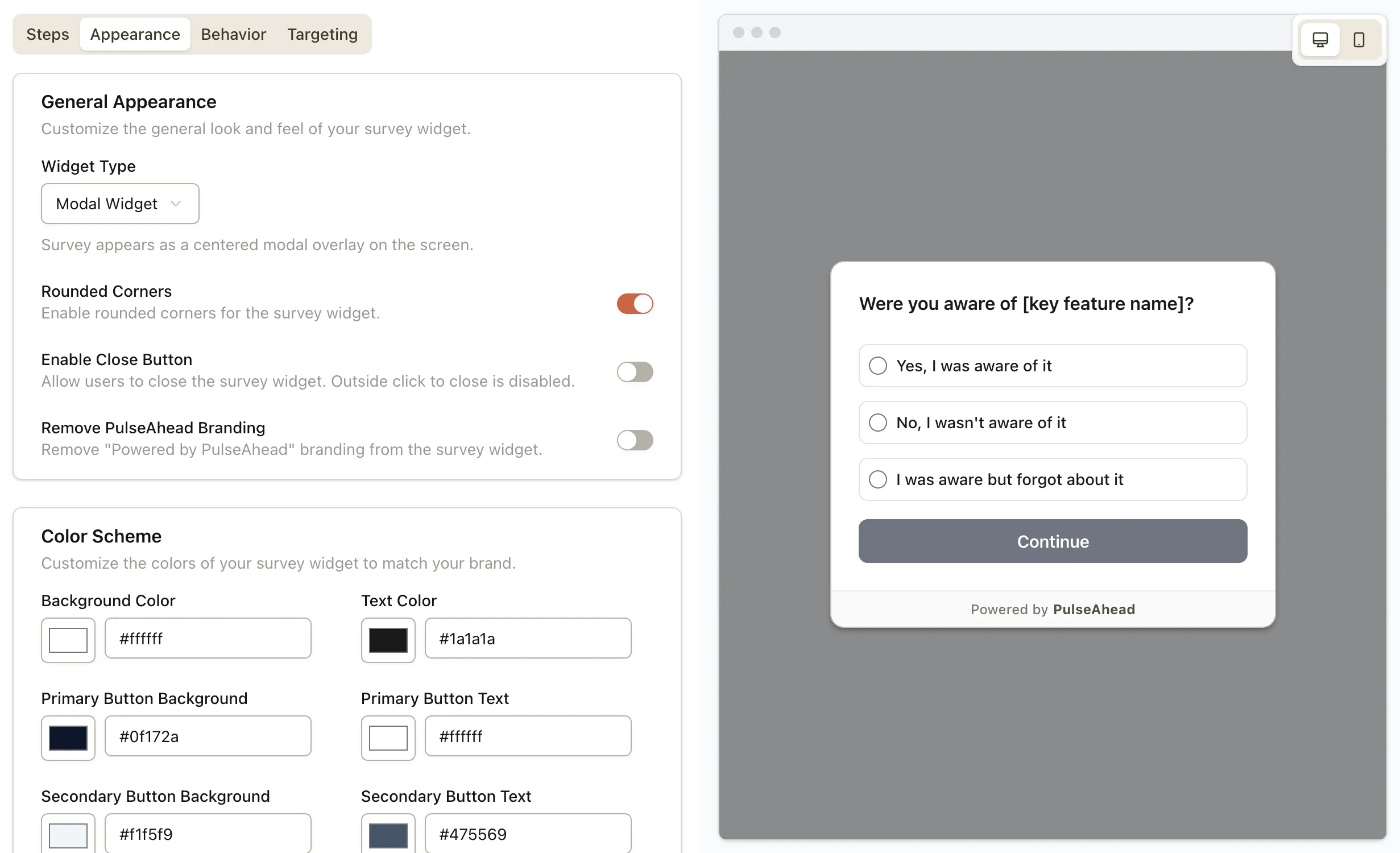
Surveys can now open as a modal: centered on the screen, on top of everything else. Next to docked and inline embed, it is the option to use when the question needs to be seen—not parked in a corner or tucked into the layout.
Because the survey overlays the page, it draws the eye immediately. That matters when the answer is time-sensitive or tied to a decision you cannot guess (for example, why someone is canceling or what went wrong after a failed payment).
What’s New
- Modal as a widget type in Survey Appearance, alongside docked and embedded-in-HTML.
- Centered layout so the survey owns focus without a full page navigation.
- Close button remains optional — leave it on for light asks; turn it off when you need the survey finished before people return to the underlying flow (for modal, disabling close also turns off outside-click dismiss).
When to use it
A modal is not for every question. Use it when skipping or ignoring the prompt would cost you signal—churn and cancellation flows are the obvious example: one last structured step to capture why before they leave.
You can also use it after a rough moment (billing failure, a bad experience) or when you need a short, unavoidable checkpoint—without treating it as a wall: keep the survey short, the copy respectful, and close enabled unless you have a clear reason not to.
What this means for you
- Clearer choice between a persistent dock tab, an inline embed, and a modal that behaves like a focused, page-level popup when you need it.
- Fewer missed prompts on busy screens where a corner widget is easy to tune out.