The SaaS Metrics Dashboard
The SaaS Metrics Dashboard aggregates responses from all six pack surveys into a single view. Instead of reviewing individual survey results, you get a set of product health metrics you can monitor over time and act on.
Each metric on the dashboard is linked to the survey that produces it. You can click into any chart to see the underlying individual responses.
Metrics and charts
Section titled “Metrics and charts”Activation Confidence Rate
Section titled “Activation Confidence Rate”Source survey: Early Activation Confidence
The percentage of new users who responded “very confident” or “somewhat confident” when asked how they feel using your product.
A declining trend here often precedes a drop in retention. Watch for this metric falling below 70% or trending downward across cohorts.
If the score is low: Review your onboarding flow and in-app documentation for friction points that may be blocking users from reaching their first meaningful outcome.
PMF Score
Section titled “PMF Score”Source survey: Product-Market Fit (Sean Ellis Test)
The percentage of users who say they would be “very disappointed” if they could no longer use your product. A score of 40% or above is generally considered a strong signal of product-market fit.
If the score is low: Focus on users who answered “somewhat disappointed.” They already see some value — understanding what is missing for them is often the most productive place to start.
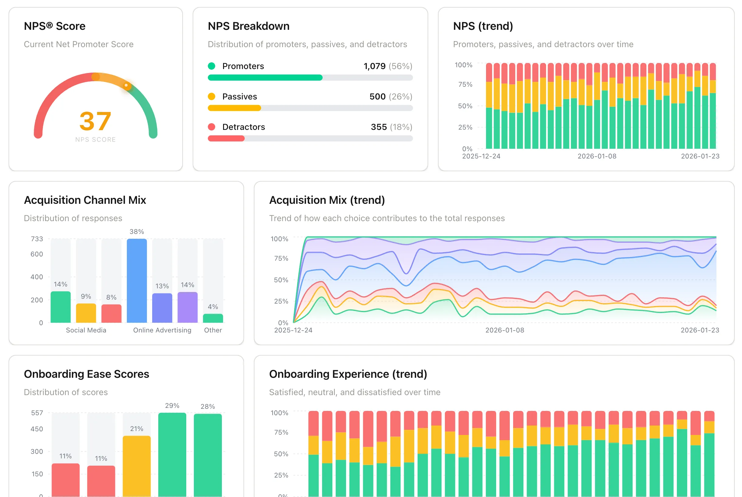
Net Promoter Score (NPS®)
Section titled “Net Promoter Score (NPS®)”Source survey: Quarterly In-App NPS
Calculated as Promoters % minus Detractors %. The dashboard shows your current NPS score, a breakdown of promoters, passives, and detractors, and how the score has trended over time.
If NPS is declining: Look at the detractor responses for recurring themes. Direct outreach to detractors often surfaces issues that do not show up in other channels.
Acquisition Channel Mix
Section titled “Acquisition Channel Mix”Source survey: User Profile
Shows where your signed-up users first heard about you. Use this to understand which channels are bringing in users and, when cross-referenced with PMF or NPS segments, which channels bring in your best-fit users.
This is a self-reported first-touch attribution signal. Analytics tools track last-touch (the channel a user clicked immediately before signing up), but they miss the channel that originally put you on a user’s radar. Word-of-mouth, a podcast mention, or a tweet rarely shows up in UTM data. Asking users directly captures that original exposure, which is often the more meaningful one. When you combine both, you get a clearer picture of how your acquisition funnel actually works.
Onboarding Ease Score
Section titled “Onboarding Ease Score”Source survey: Onboarding Experience
Distribution of how easy users found it to get started with your product. Responses are scored on a rating scale, with the chart showing the spread across all score bands and how that distribution shifts over time.
If scores are low or dropping: Look for friction in your initial setup flow, empty states, or first-run experience. Low scores here often correlate with early churn. Read the qualitative follow-up responses to find the specific steps users found difficult.
Churn Exit Reasons
Section titled “Churn Exit Reasons”Source survey: Churn & Cancellation
A breakdown of the reasons users give when they cancel. Common categories include pricing, missing features, and finding an alternative. This chart shows the distribution across those reasons over your selected time period.
If one reason dominates: Treat it as a signal worth investigating further. Click into the chart to read the individual responses and look for patterns in the qualitative follow-up answers.
Getting more from the dashboard
Section titled “Getting more from the dashboard”Monitor trends, not just snapshots. A single data point tells you where you are. The trend over time tells you whether things are improving or declining. Check Activation Confidence and NPS on a regular cadence rather than only when something feels off.
Segment by user type. The User Profile survey collects role and company type. Use those attributes to segment your PMF and NPS scores and see whether certain user groups rate the product differently. This often reveals which audience segments are the best fit. (coming soon)
Next: Refine who sees surveys and when in Audience Targeting, User segments, and Behavior & Frequency.