Steps & Question Types
A Pulseahead survey is a sequence of steps. Each step is a single screen the respondent sees. When you add a step to a survey, you choose its type, configure its content, and optionally set up Adaptive Flow to control what comes next based on the response.
New surveys are created from the dashboard in several ways; see Ways to create a survey before you tune individual steps here.
Adding and managing steps
Section titled “Adding and managing steps”In the survey editor, open the Steps tab. Use Add Step to insert a new step and select its type from the panel. You can reorder steps by dragging them in the sidebar.
Step types
Section titled “Step types”Net Promoter Score (NPS)
Section titled “Net Promoter Score (NPS)”A 0-10 scale asking how likely someone is to recommend your product to a friend or colleague.
- Data collected: A single integer from 0 to 10.
- Best for: Measuring overall loyalty and splitting responses into promoter, passive, and detractor segments.
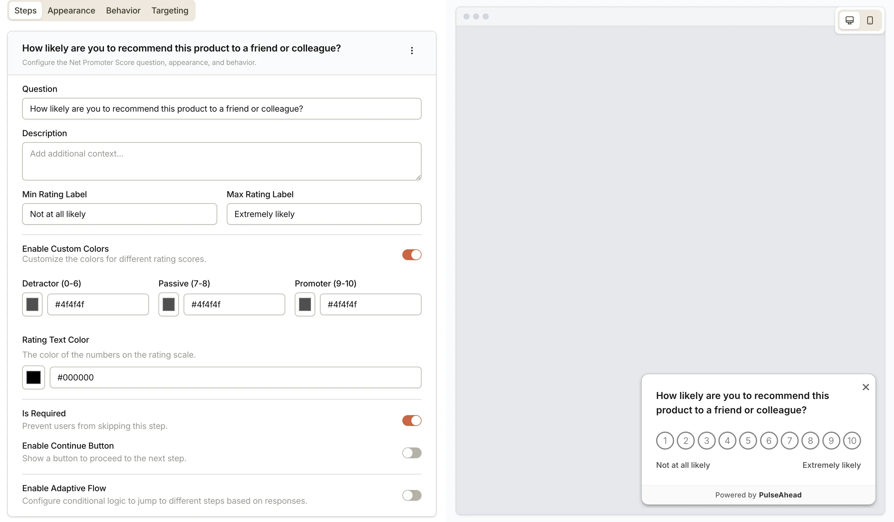
| Setting | Description |
|---|---|
| Question | The main question text shown to the respondent. |
| Description | Optional supporting text shown below the question. |
| Min Rating Label | Label shown beneath the lowest score (e.g. “Not likely”). |
| Max Rating Label | Label shown beneath the highest score (e.g. “Very likely”). |
| Custom Colors | When enabled, set a distinct background color per segment: detractors (0-6), passives (7-8), and promoters (9-10). |
| Rating Text Color | Color of the numbers rendered on each score button. Only available when Custom Colors is enabled. |
| Is Required | When on, respondents cannot skip this step. When off, a skip button appears with a customizable label (default: “Skip”). |
| Continue Button | Show a button to advance to the next step. You can customize the button label (default: “Continue”). |
| Adaptive Flow | Set conditional logic to route respondents to a different step based on their score. |
Rating
Section titled “Rating”A visual scale using stars or smileys, with optional min/max labels.
- Data collected: A numeric rating on a 5-point scale.
- Best for: Quick CSAT scores or feature-level sentiment checks.
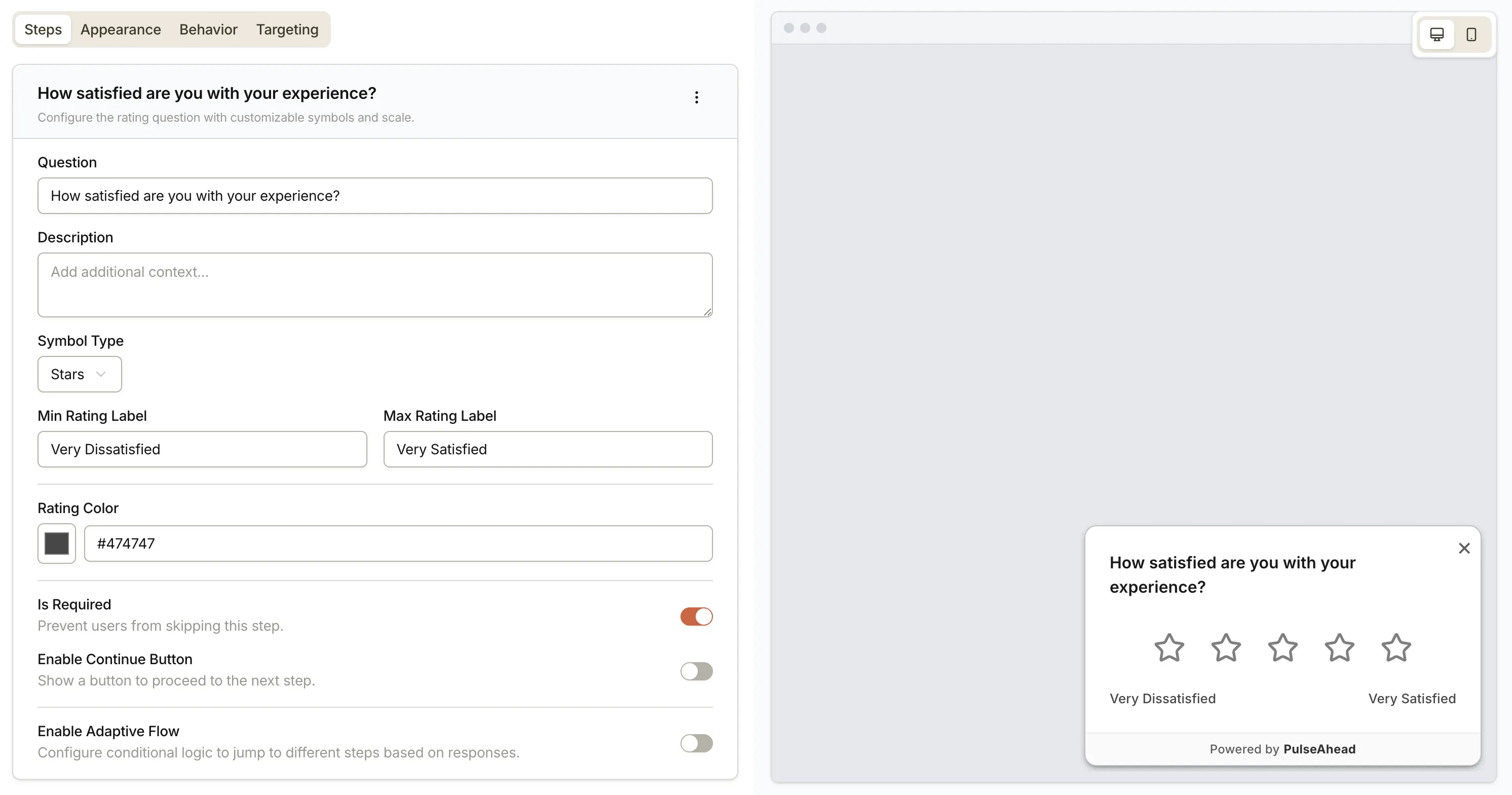
| Setting | Description |
|---|---|
| Question | The main question text. |
| Description | Optional supporting text below the question. |
| Symbol Type | Choose between Stars or Smileys. |
| Min Rating Label | Label shown beneath the lowest value. |
| Max Rating Label | Label shown beneath the highest value. |
| Rating Color | The fill color of the selected symbols. |
| Is Required | When on, respondents cannot skip this step. When off, a skip button appears with a customizable label. |
| Continue Button | Show a button to advance to the next step. Label is customizable. |
| Adaptive Flow | Route respondents to different steps based on the rating they select. |
Choice Question
Section titled “Choice Question”A list of options you define. Supports single and multiple selection.
- Data collected: The selected option ID(s) and label text.
- Best for: Role or plan segmentation, prioritization, or identifying specific pain points.
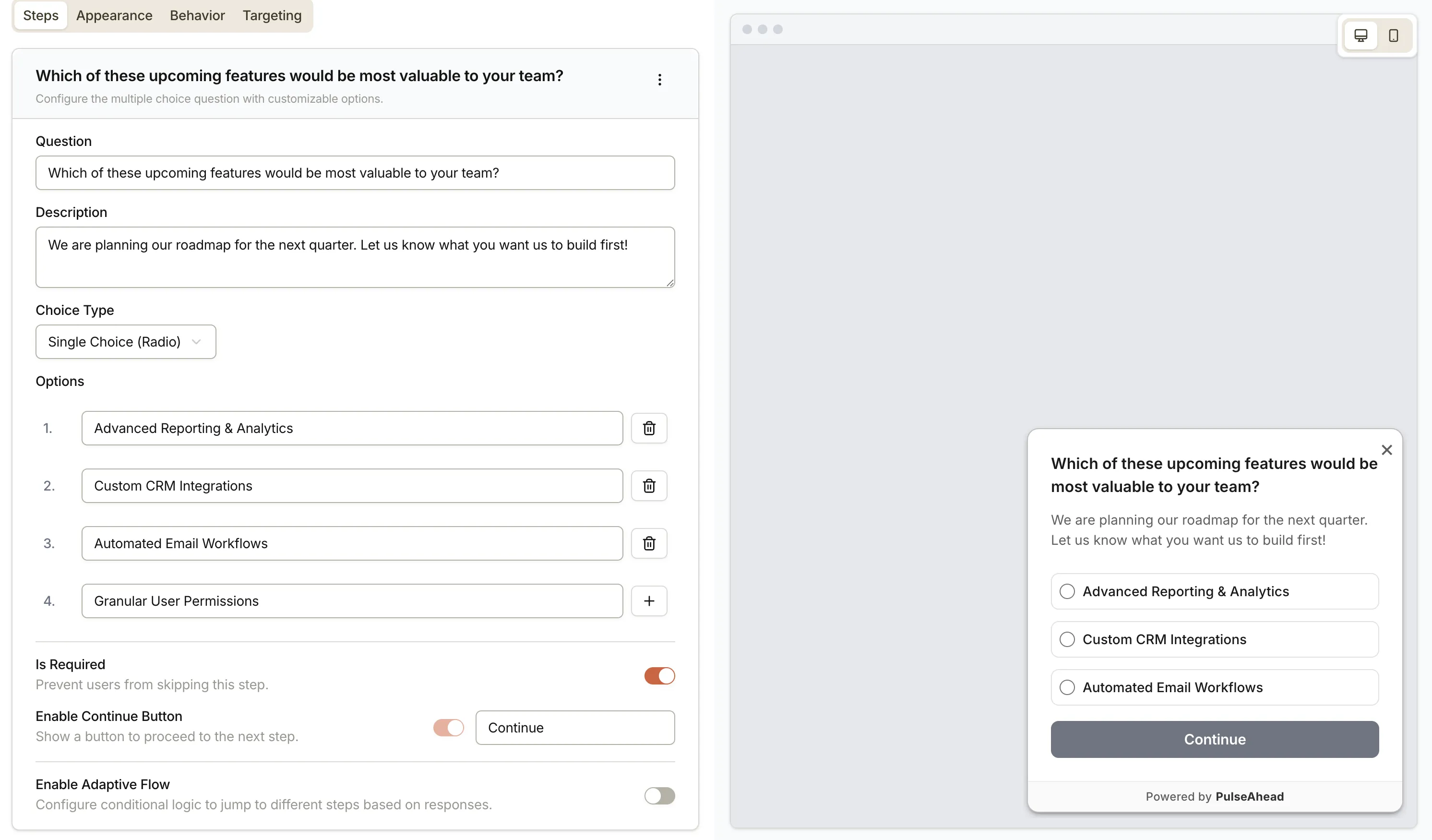
| Setting | Description |
|---|---|
| Question | The main question text. |
| Description | Optional supporting text below the question. |
| Choice Type | Single Choice (radio) — respondent picks one option. Multiple Choice (checkbox) — respondent picks one or more. |
| Options | The list of answer choices. Add options one at a time by typing and pressing Enter or clicking the add button. Each option can be edited or deleted inline. |
| Is Required | When on, respondents cannot skip this step. When off, a skip button appears with a customizable label. |
| Continue Button | Always on for choice questions. You can customize the button label. |
| Adaptive Flow | Route respondents to different steps based on which option(s) they select. |
Long Text
Section titled “Long Text”A multi-line free text input.
- Data collected: The full text of the response.
- Best for: Qualitative detail, open-ended follow-ups, or bug reports.
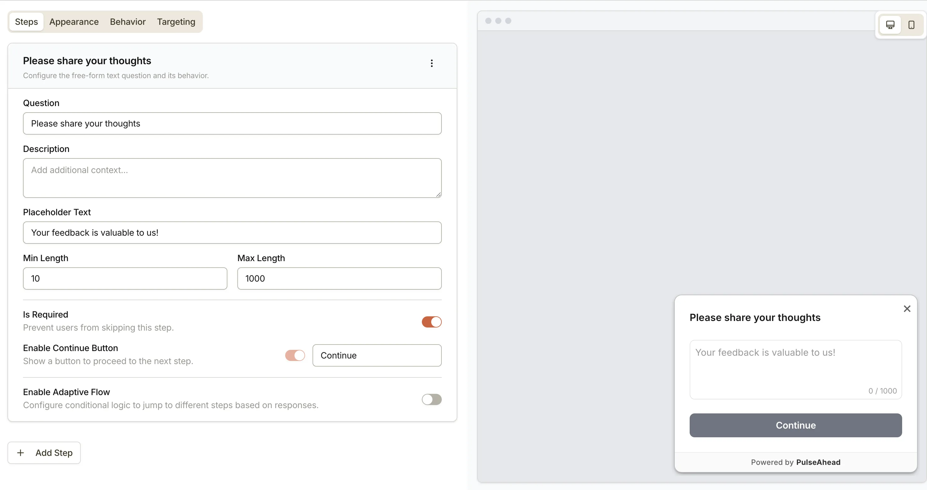
| Setting | Description |
|---|---|
| Question | The main question text. |
| Description | Optional supporting text below the question. |
| Placeholder Text | Ghost text shown inside the text area before the respondent types. |
| Min Length | Minimum number of characters required before the step can be submitted. Set to 0 to disable. |
| Max Length | Maximum number of characters the respondent can enter. |
| Is Required | When on, respondents cannot skip this step. When off, a skip button appears with a customizable label. |
| Continue Button | Always on for long text steps. You can customize the button label. |
| Adaptive Flow | Route respondents to different steps after they submit their text. |
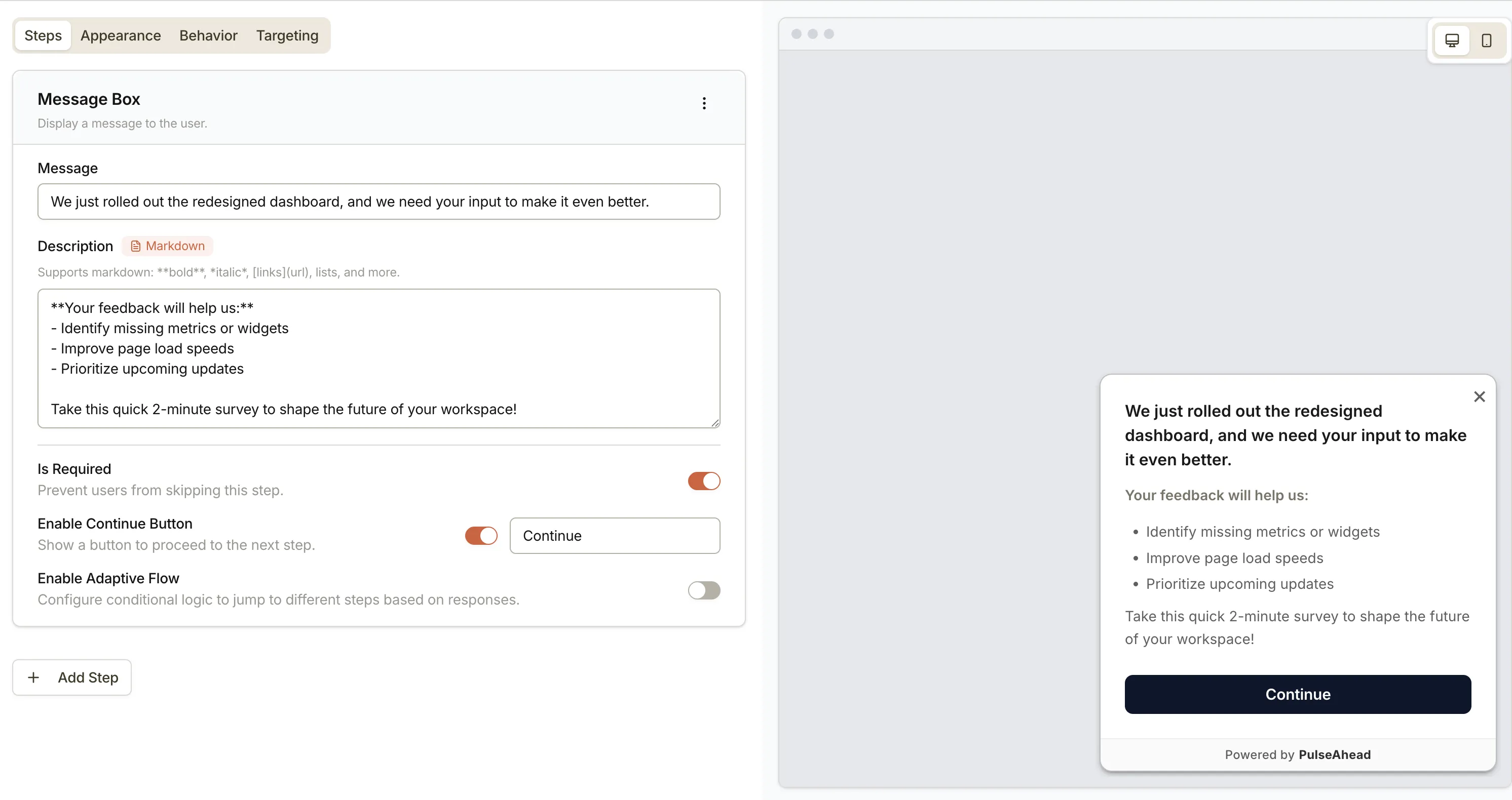
Message Box
Section titled “Message Box”A static screen with text and no response input.
- Best for: Providing context before a question, announcing a feature, or showing a mid-survey acknowledgment.
| Setting | Description |
|---|---|
| Message | The primary headline or title shown on the screen. |
| Description | Supporting body text. Markdown formatting is supported on paid plans. |
| Is Required | When on, respondents cannot skip this step. When off, a skip button appears with a customizable label. |
| Continue Button | Show a button to advance. Label is customizable. |
| Adaptive Flow | Route respondents to different steps after they view the message. |
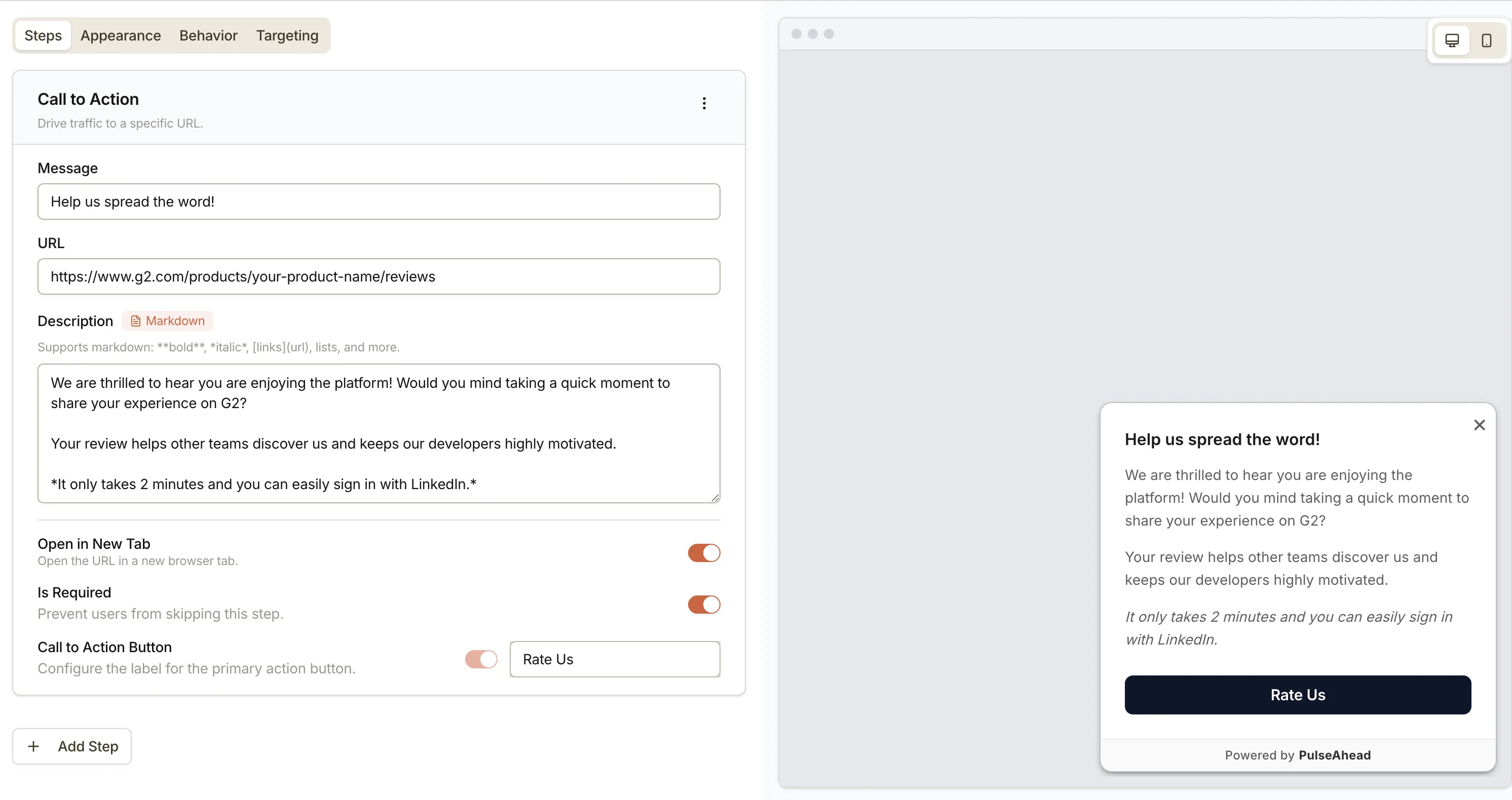
Call to Action (CTA)
Section titled “Call to Action (CTA)”A screen with a message and a primary button that opens a URL.
- Best for: Directing respondents to a review site (such as G2), a scheduling link, or a documentation page after they complete the survey.
| Setting | Description |
|---|---|
| Message | The headline text shown above the button. |
| Description | Optional supporting body text. Markdown formatting is supported on paid plans. |
| URL | The destination URL the button opens. |
| CTA Button Label | Label for the primary action button that opens the URL. |
| Open in New Tab | When on, the URL opens in a new browser tab instead of the current one. |
| Is Required | When off, a skip button appears with a customizable label. |
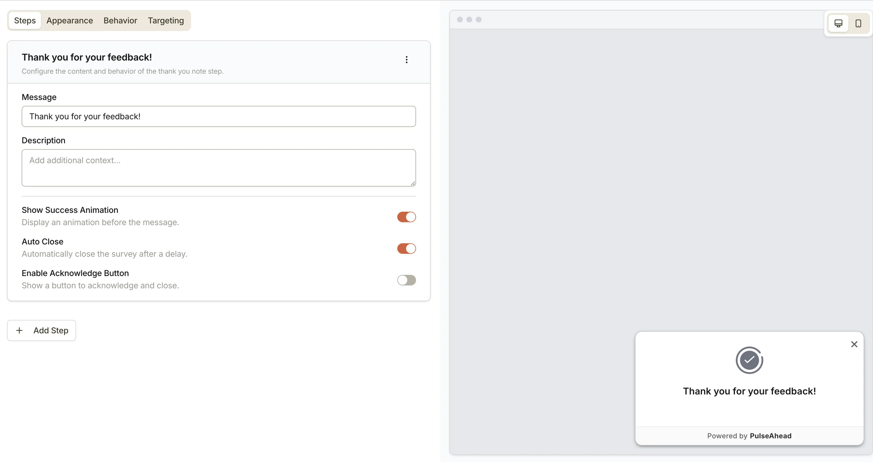
Thank You Note
Section titled “Thank You Note”A closing screen that ends the survey.
- Best for: Confirming that the submission was received and ending the survey on a clear note.
| Setting | Description |
|---|---|
| Message | The main closing message (e.g. “Thank you for your feedback!”). |
| Description | Optional supporting text below the message. |
| Show Success Animation | Display a short animation before the message appears. |
| Auto Close | Automatically dismiss the survey widget after a short delay. Mutually exclusive with the Acknowledge button. |
| Acknowledge Button | Show a button respondents can click to close the widget. You can customize the button label (default: “Got it”). Mutually exclusive with Auto Close. |
Choosing a step type
Section titled “Choosing a step type”| I want to… | Use this step type |
|---|---|
| Measure overall loyalty | NPS |
| Get a quick satisfaction rating | Rating |
| Understand user roles or goals | Choice Question |
| Capture detailed qualitative feedback | Long Text |
| Show context or an announcement | Message Box |
| Send respondents to an external URL | Call to Action |
| Confirm the survey is complete | Thank You Note |
Next steps
Section titled “Next steps”- Set up Adaptive Flow to route respondents to different steps based on their answers.
- Customize appearance to control how the survey looks on the page.
- Set up targeting to control who sees the survey and when.
- Survey Analytics to read aggregated results after responses come in.