Survey Appearance
The Appearance tab in the survey editor controls how a survey is displayed on the page. You can set the widget type and placement, adjust colors, and remove Pulseahead branding on eligible plans.
To open it, go to the survey in your dashboard and select the Appearance tab (alongside Steps, Behavior, and Targeting).
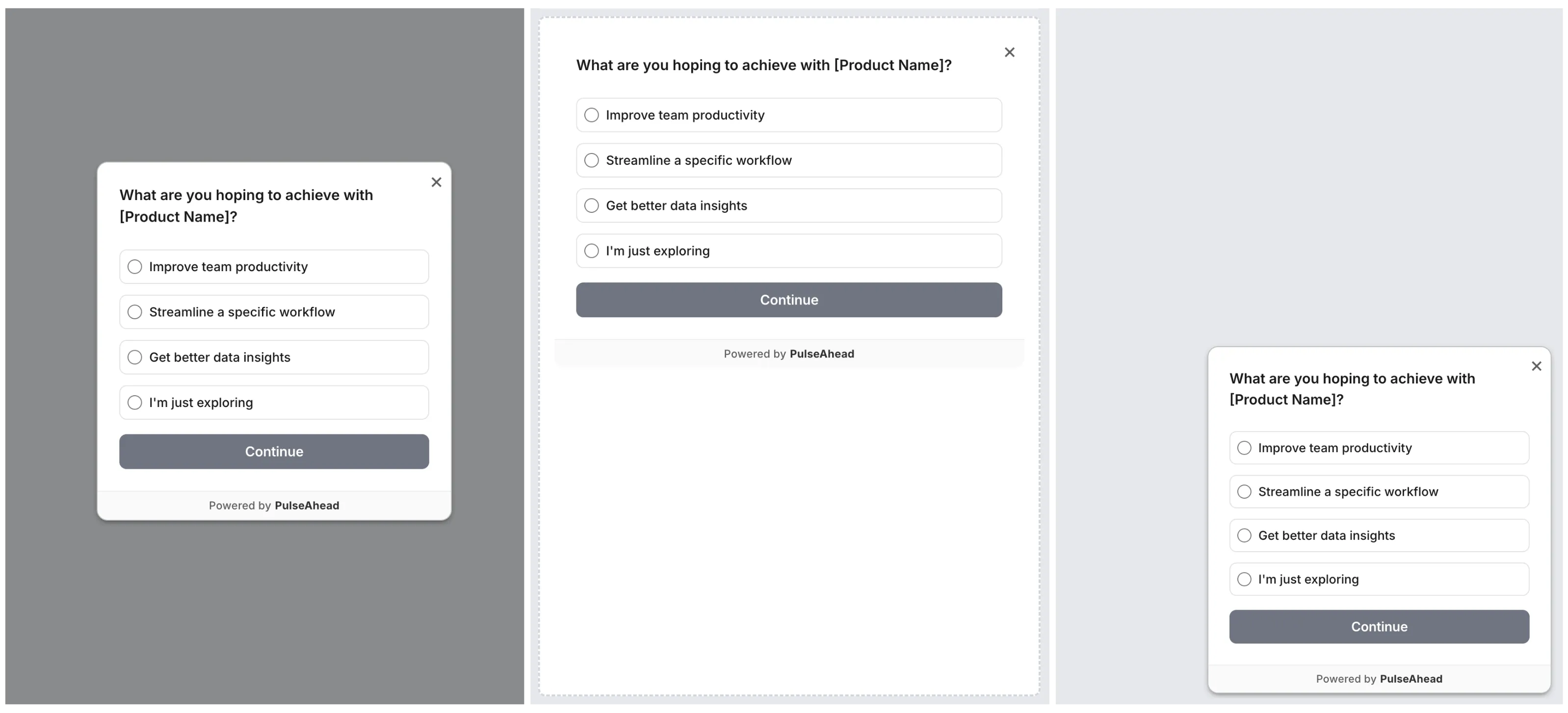
Widget type
Section titled “Widget type”Choose how the survey appears on the page.
| Type | Description |
|---|---|
| Docked Widget | A floating widget anchored to a corner of the page. Does not interrupt the user’s current task. |
| Modal Widget | A centered overlay that appears on top of the page. Higher visual weight than a docked widget. |
| Embedded in HTML | Rendered inside a specific DOM element you identify with a CSS selector. |
Choosing between them:
- Use Docked for passive, low-friction feedback that stays out of the main layout.
- Use Modal for higher-priority surveys where you want more attention, such as a churn exit survey.
- Use Embedded when you want the survey to appear inline inside your product UI, such as inside a dedicated Feedback panel or settings page.
Docked placement
Section titled “Docked placement”When using the Docked widget, choose where it appears: Bottom Right, Bottom Left, Top Right, or Top Left.
Embedded placement
Section titled “Embedded placement”When using the Embedded widget, enter a CSS selector for the element where the survey should mount.
Example: #survey-container or .feedback-panel
The element must exist on the page when the survey loads.
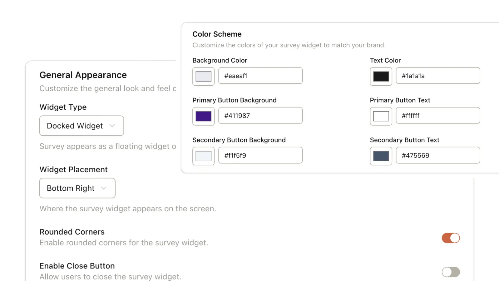
Visual settings
Section titled “Visual settings”Rounded corners
Section titled “Rounded corners”Toggle between rounded and sharp widget corners to match your product’s design language.
Close button
Section titled “Close button”Enable or disable the close button that lets users dismiss the widget. When disabled for modal widgets, clicking outside the modal may also be affected (noted in the editor UI).
Color scheme
Section titled “Color scheme”Customize the survey’s colors to match your brand. The following fields are available:
| Field | Controls |
|---|---|
| Background Color | The main background of the widget. |
| Text Color | All body text within the survey. |
| Primary Button Background | Buttons for primary actions like Next and Submit. |
| Primary Button Text | Text on primary action buttons. |
| Secondary Button Background | Buttons for secondary actions. |
| Secondary Button Text | Text on secondary action buttons. |
Remove Pulseahead branding
Section titled “Remove Pulseahead branding”By default, surveys display a “Powered by Pulseahead” link. This can be removed on the Pro plan.
To remove branding:
- Open the Appearance tab in the survey editor.
- Under General Appearance, enable Remove Pulseahead Branding.
Mobile behavior
Section titled “Mobile behavior”Surveys are responsive. On smaller screens, docked and modal widgets shift toward the bottom of the viewport for easier tap targets. No additional configuration is needed for mobile.
Next steps
Section titled “Next steps”- Ways to create a survey to pick a template, AI, or blank path before you polish visuals.
- Set up audience targeting to control who sees the survey.
- Configure behavior and frequency to set when and how often it appears.