Teams often obsess over the questions in an in-app survey and treat how it shows up as a styling afterthought. That order is backwards. The format controls whether people notice the survey, trust it, dismiss it, or feel interrupted by it. Same copy in a modal, a corner widget, or an inline block can produce very different completion rates and very different feedback quality.
This guide compares three practical choices: popup surveys (modal overlays), survey widgets (docked surveys), and embedded surveys (inline in the product UI).
If you are still choosing whether in-product feedback belongs in your stack, types of survey tools for SaaS lays out the wider landscape. Pulseahead is built for in-app surveys across those three display modes, with shared styling and behavior controls so format stays aligned with product UX.
In-app survey format is a product decision, not just a design choice
Placement is strategy. A survey in the wrong format can bias answers (people rush through modals), annoy users (too many overlays), or get crowded out (a corner widget competing with chat).
- High-attention prompts can lift completion but add interruption cost.
- Less blocking formats lower friction but can get less focused attention.
- Inline formats feel native only when the surrounding screen matches the question.
Pick format from urgency, user context, workflow sensitivity, and how much attention the question deserves.
What is a popup survey?
A popup survey sits on top of the interface and asks for attention now.
Popups fit time-sensitive or high-priority feedback moments: a post-onboarding check-in, a churn or cancellation reason, a trial upgrade blocker, quick sentiment after a support interaction, migration or admin setup checkpoints, or beta access questions.
They can stay optional (user can dismiss), or, when the close control is turned off, behave more like required feedback or critical input for flows where the product genuinely needs an answer before the user continues. Reserve that pattern for cancellation, compliance-sensitive setup, migration, or other checkpoints where skipping would be worse than asking. It is a poor fit for routine NPS, broad research, or low-importance polls.
For app-controlled timing (for example, right after the user clicks “Cancel subscription”), use a manual trigger from your code instead of assuming surveys appear automatically from product events unless you have configured the right rules.
Popup survey strengths
- High visibility when you need a signal in the moment.
- Strong for immediate feedback tied to a specific action.
- Natural at decision points where the user already expects a question (for example before leaving).
Popup survey tradeoffs
- More interruptive than other modes; overuse trains dismissals.
- Higher frustration risk if frequency and audience are too loose.
- Weak for long exploratory research where people need time and space.
Popup survey example
“Before you cancel, what is the main reason you are leaving?” Use a short multiple-choice step first, then optional free text. That pattern matches how people actually answer under stress. The churn exit survey template is a practical starting point.
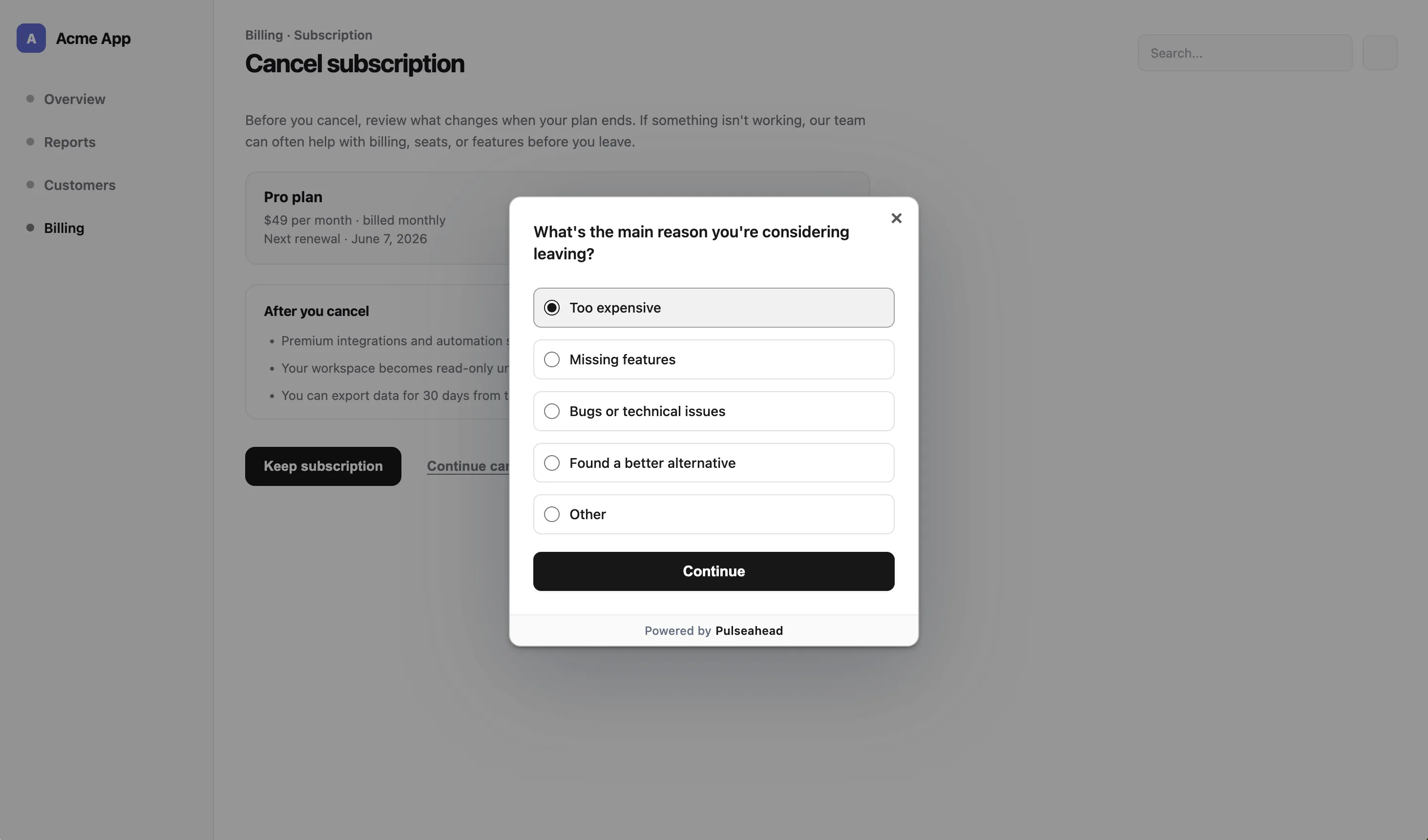
Popup survey for a cancellation reason using Pulseahead
What is a survey widget?
A survey widget here means a docked survey: a fixed corner prompt that does not block the page. In Pulseahead, docked widgets support bottom right, bottom left, top right, and top left placement.
Widgets suit low-interruption feedback: feature ideas, bug reports, general sentiment, and ongoing UX notes. They work well in long-session SaaS products where someone may want to speak up when the prompt is relevant, not when a modal interrupts them.
Docked widget strengths
- Lower interruption than a modal.
- Contextual visibility when the right targeting and trigger rules are met.
- Good for a feedback channel that stays out of the main workflow.
Docked widget tradeoffs
- Lower peak visibility than a popup because it does not take over the screen.
- Less forceful than a modal, so completion rates may be lower for one-off campaigns.
- Can clash visually with support chat, nav, or corner actions if placement is not coordinated.
Docked widget example
“How likely are you to recommend us to a colleague?” in a bottom-right docked widget keeps recurring NPS collection visible without hijacking the flow. The NPS survey template is a fast way to launch this format.
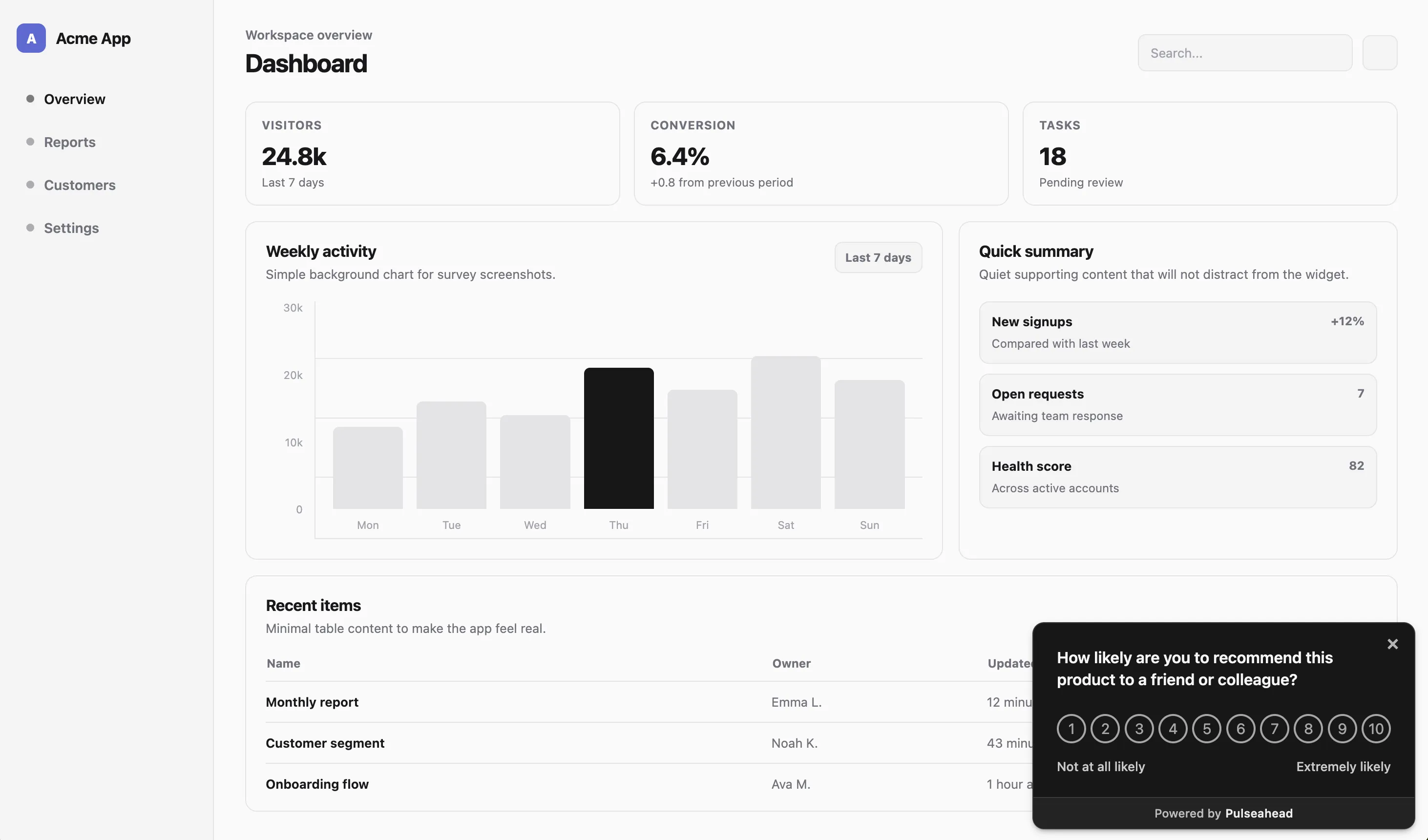
Docked NPS Survey Example using Pulseahead
What is an embedded survey?
An embedded survey is part of the page, not layered above it. In Pulseahead, embedded surveys mount into a specific element (via a selector) so the survey reads as native UI.
Use embedded surveys when context matters more than urgency: onboarding checklists, settings panels, feature detail pages, help center “was this helpful?” blocks, beta program intake, or a post-setup confidence check.
Embedded survey strengths
- Most native UX among the three when the container matches the workflow.
- Strong context relevance because the question sits next to the thing it refers to.
- Better for thoughtful input where a modal would feel pushy or odd.
Embedded survey tradeoffs
- Needs a real surface in the product; not every question has a home.
- Can be missed if users do not scroll to the section or rarely visit that screen.
- More implementation planning than floating overlay or docked patterns.
Embedded survey example
“How clear was this setup step?” directly under an onboarding checklist ties the question to the task the user just performed.
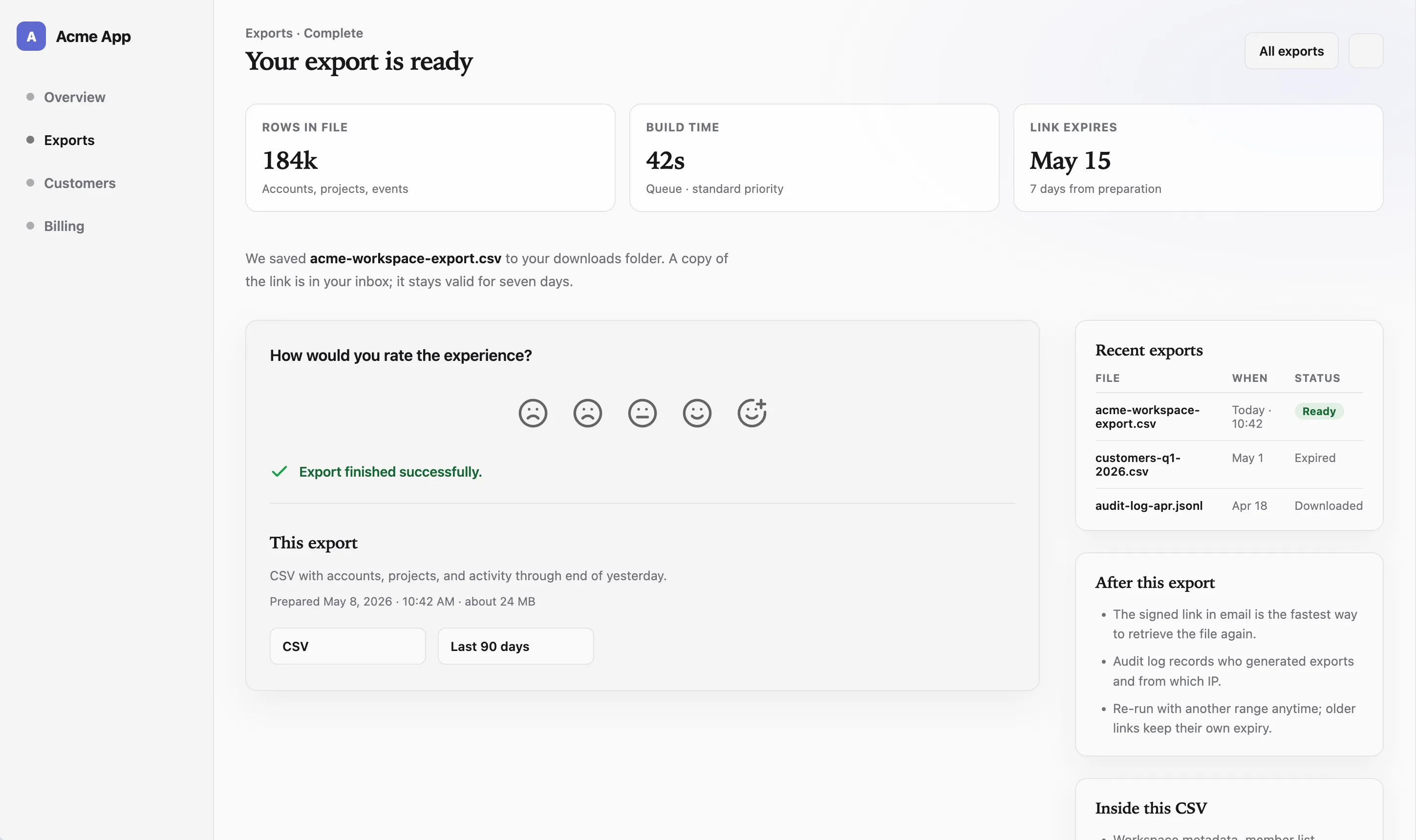
Embedded survey after a meaningful user action using Pulseahead
Popup survey vs widget vs embedded survey
Use this table as a decision asset. There is no single winner; each row describes a tradeoff, not a scorecard.
| Factor | Popup / overlay | Widget / docked | Embedded |
|---|---|---|---|
| Attention level | High | Medium to low | Medium |
| Interruption | Highest | Low | Lowest |
| Best for | Time-sensitive prompts | Low-interruption feedback | Native workflow feedback |
| Response urgency | High | Low to medium | Medium |
| UX risk | Can annoy if overused | Can be ignored | Can be missed off-screen |
| Setup complexity | Low | Low | Medium |
| Example | Cancellation reason | Recurring NPS survey | Onboarding checklist question |
The right answer depends on the job of the survey, not the format badge. Many mature products run more than one format for different jobs.
Build overlay, docked, and embedded surveys with ease.
Choosing the right format for the feedback moment
Use a popup when attention matters more than interruption
Reach for an overlay when delaying the question loses the signal: cancellation, upgrade blockers, immediately after a critical action, admin setup, migration, beta access gates, or a welcome survey asking where users first heard about the product and what role they have in their company.
Use a docked widget when low interruption matters more than completion rate
Recurring NPS, onboarding feedback, product-market fit surveys, bug reports, feature requests, passive product sentiment, and “anything else?” style channels fit a corner widget when the prompt should stay visible without taking over the screen. Pair with clear copy so people know what you want.
Use an embedded survey when context matters more than visibility
Embedded surveys work best when the question belongs next to the thing the user is evaluating: a confidence check under an onboarding task, a “was this helpful?” block inside help content, feedback below a new feature panel, a quick ask after an integration setup step, or a question inside a settings screen after the user changes a configuration.
Use more than one format when the feedback system has several jobs
Example: overlay for churn, docked widget for recurring NPS, embedded steps inside onboarding. That is not three tools; it is one strategy with different surfaces.
The interruption problem
Teams often overuse high-visibility formats because they want more responses. Popups can work, but overuse trains users to dismiss. Required-style overlays should pass a simple test: does the user need to answer before continuing, or does the team only want more responses?
The “ask everyone immediately” mistake
Broad audiences plus aggressive timing yields noise and resentment. Narrow the who, the where, and the when before you reach for a modal.
The required feedback test
Ask honestly: is this answer blocking a safe or correct next step for the user or the business? If not, prefer a less blocking format or a softer schedule.
The minimum viable interruption
Pick the least interruptive format that still gets the signal. Sometimes that is embedded. Sometimes it is a docked widget with a strong first line. Sometimes it is still a popup, but only for a short window after a precise trigger.
Survey fatigue is as much a product bug as a research problem. Pulseahead supports controls such as global cooldown and re-survey delay so that users do not get overwhelmed by surveys. Close-button-disabled modals belong in that same “use sparingly” bucket: powerful for critical input, harmful when normalized.
If you are publishing for the first time, launch your first survey with Pulseahead.
The best in-app survey format fits the moment
Popup surveys earn their keep when the question deserves attention now. Docked widgets win when people should be able to respond without leaving the screen. Embedded surveys win when the survey should read as part of the product, not a layer on top.
Strong SaaS teams treat format as part of feedback strategy, not cosmetics. Pulseahead keeps overlay, docked, and embedded in one place so you can match each survey to the moment, style it like your product, and govern how often users see it.