You can learn about your users in a lot of ways. User interviews give you depth. Feedback boards surface requests from your most vocal users. Support tickets show you what is broken. Analytics tell you what people click, where they drop off, and how often they come back.
Each of these is useful. None of them covers the full picture on its own.
In-product surveys sit in a different category. They reach users while they are actively using the product, in context, at a specific point in their journey. They are not intrusive when done right. And they fill the qualitative gap that behavioral data leaves open: not just what happened, but why.
In SaaS specifically, this matters more than in almost any other business model. You are not selling a one-time product. You are selling a relationship that renews every month or every year. Every churned user represents a compounding loss: the recurring revenue that stops, plus the acquisition cost required to replace them with someone new who then needs to reach the same activation milestone before they stick. Churn is expensive in a way that does not always show up clearly in a single month’s numbers but absolutely shows up in your growth curve over time.
Getting feedback at the right moments in the customer lifecycle is how you catch problems before they become churn, improve the experience before it becomes a barrier, and understand what is actually driving the users who stay.
This article covers six feedback surveys that together span the critical moments of the SaaS user journey, from the day someone signs up to the day they decide to leave. For each, I will explain what it captures, why it matters at that specific stage, and when to ask so the data is actually useful. At the end, I will show you how to get all six running in minutes using Pulseahead.
TL;DR
Six surveys, six moments in the user journey where asking the right question gets you signal you cannot get any other way:
- After signup - Who are they and where did they come from? (User Profile)
- After initial setup - How easy was it to get started? (Onboarding Experience)
- Around their first real product interaction - How confident do they feel? (Activation Confidence)
- After sustained, regular usage - Would they miss it if it disappeared? (Product-Market Fit)
- On a recurring cadence - Would they recommend it? (NPS)
- At the exit point - Why are they leaving? (Churn and Cancellation)
Each survey has specific trigger conditions that determine whether the data is accurate or noise. And the most useful thing you can do with the results is read all six together.
All 6 lifecycle surveys, pre-built and ready to launch.
1. User Profile Survey
You probably have attribution tracking set up already. UTMs on your links, some form of analytics on the marketing site. That gives you click-based attribution, which covers a real portion of how users find you. What it does not give you is any picture of who those users actually are.
Three questions, asked once, right after signup, fill in what your analytics leave out: what kind of company they are at, what their role is, and how they first heard about you.
Company type and role are the segmentation layer your other surveys cannot function without. When your NPS score starts shifting, you want to know whether it is shifting for everyone or only for a specific segment. Are founders experiencing the product differently than operations teams? Are enterprise customers churning at a higher rate than startups? Are users from agencies activating more slowly than solo operators? Without this data collected at signup, you are reading aggregate numbers with no way to slice them. The profile survey is what gives every downstream data point its context.
Channel attribution closes the gap that click-based tracking leaves open. Not all attribution is click-based. A meaningful share of users who sign up never clicked a tracked link. They heard about you from a colleague. Someone recommended you in a Slack community. They heard your name through an AI assistant while researching tools, which generates no UTM and often no referral signal at all. None of that produces a trackable click.
Here is what makes this harder: even when a user does click through eventually, it often follows a brand search. Someone hears about you through word of mouth, Googles your product name, and lands via organic search or direct traffic. Your last-touch model credits organic or direct. The actual source was a recommendation you have no visibility into.
Asking directly, once, right after signup, is the only way to get reported attribution. It is the one type of attribution you cannot get any other way.
Ask this on the user’s first visit to your dashboard, right after they land. Memory is sharpest at this moment. Ask later and recall drops. And because all three questions are in a single survey, you collect the full picture in one pass — context you can attach to every other response across the rest of the lifecycle.
2. Onboarding Experience Survey
Funnel analytics show you where users drop off. They cannot tell you why.
What “onboarding” means is different for every product. For an SEO tool, it might mean connecting a domain, setting up keyword tracking, and running the first site audit. For an expense tracking app, it is linking a bank account, categorizing transactions, and generating a first report. For a CRM, it is importing contacts, building a pipeline, and logging the first activity. For a design collaboration tool, it might mean creating a project, setting up the first file structure, and sharing access with a teammate.
In each case, a user can reach the end of your onboarding checklist and still not have done the thing that actually makes your product valuable. They completed the steps on paper. They did not experience the value.
A user who got through setup but found it confusing is not the same as one who found it effortless. Both show up identically in your funnel metrics. Only one is set up to stick around.
The onboarding experience survey captures the qualitative layer that product analytics leave out. How easy was it to get started? What got in the way? What were you still unclear about after finishing setup? Those answers point directly at the friction your analytics can see in the numbers but cannot explain.
Ask this after users have had time to actually go through setup and return at least once. The experience needs to settle before the question is meaningful.
3. Early Activation Confidence Survey
Every SaaS product has an activation moment. It is the point where a user first gets genuine value from your product, not just completing setup, but actually experiencing what the product does for them.
For Slack, it is sending the first message and getting a reply. For a file storage tool, it is uploading a file and accessing it from another device. For an analytics tool, it might be the first time a user sees a report populated with their own data. For a project management tool, it could be completing a task within a shared team workflow. The moment is different for every product, but identifying it is one of the most important things you can do early on. It is the leading indicator of retention.
Onboarding completion tells you that a user followed the steps. Activation tells you that they got somewhere worth staying for.
The early activation confidence survey is timed around the point when users should be reaching that activation moment. That timing is intentional. Asking here captures both sides: users who have reached activation and feel confident, and users who have not yet gotten there and may be struggling or still figuring it out. That split is where the insight is. The confident users confirm what is working in your activation path. The ones who are struggling tell you exactly where it is breaking down.
If a significant share of users say they are still figuring it out at this stage, that is not a support problem. It is a product problem.
Ask around the time when users would typically be hitting that activation moment in their journey. Too early and you catch people who have not had a real chance yet. Too late and the uncertainty has already turned into disengagement.
4. Product-Market Fit Survey
In 2010, Sean Ellis published the framework that would become the standard for measuring product-market fit. The test is one question: “How would you feel if you could no longer use our product?” The answer options are very disappointed, somewhat disappointed, not disappointed, and I no longer use it. The benchmark is 40% or more choosing “very disappointed.”
Ellis arrived at this threshold after surveying hundreds of users across early-stage products. Below 40%, teams consistently struggled to grow sustainably. At or above 40%, growth became more tractable. The 40% rule is not a guarantee, but it is the most validated signal available for whether a product has found genuine fit.
The score alone is useful. The trend is more useful. Run this survey consistently over time and you can watch that percentage move as you ship improvements, change positioning, or reach new user segments. A rising PMF score is one of the cleaner leading indicators that your product decisions are working.
Timing is critical. Show this to someone on their second day and the data is meaningless. They have not experienced enough to form a real opinion. You need users who have genuinely used your product enough to have an opinion worth measuring. You are looking for habitual users, not occasional visitors. Ask too early and you are measuring first impressions, not fit.
5. Quarterly In-App NPS
A single NPS snapshot tells you almost nothing on its own.
What matters is the direction it is moving, how quickly, and when the inflection happened. Net Promoter Score measures relationship health. Not whether users liked a specific feature, but whether the overall experience is strong enough that they would put their own name behind a recommendation to a colleague. The trend is where the signal lives.
Running NPS quarterly, inside the product while users are actively engaged, gives you a consistent read on how sentiment shifts over time. When the score starts declining, you want to catch that weeks before it shows up as churn. That window is where you can still do something about it.
Ask users who have been in the product long enough to have a genuine opinion about the relationship, not just the onboarding. Repeat it quarterly. The cadence is intentional: it gives the relationship time to evolve between measurements, so each reading reflects a genuine shift rather than short-term noise.
Show it on non-critical pages, not in the middle of an active workflow. Placement and timing both affect response quality.
6. Churn and Cancellation Survey
Exit data is the most honest feedback you will ever collect.
Users who are in the process of leaving have nothing to lose by being direct. They are not worried about the relationship. They are already ending it. That makes the cancellation survey uniquely valuable. The answers tend to be specific and unvarnished in a way that almost no other feedback channel produces.
The survey fires the moment a user visits your cancellation, downgrade, or account deletion page. Not after they confirm. At the decision point. You are capturing their reason while it is fresh and while they are still in your product.
If you do not yet have a dedicated feedback tool in place, at minimum make sure you are capturing some exit signal at the billing layer. Payment platforms often have basic cancellation reason collection built in. It will not give you the full picture, but having a rough category is better than nothing. An in-product exit survey goes further: open-ended follow-ups, branching based on the reason given, and the context that a single dropdown cannot surface.
Fire this immediately when a user visits your cancellation, downgrade, or account deletion flow. This is the one moment where you should bypass any global survey cooldown rules. Shown once.
Three More Worth Adding
These are not in the core six, but depending on your stage, each one adds meaningful signal.
Upgrade and Pricing Friction Survey
When a user visits your pricing, plans, or billing pages, they have something on their mind. They are evaluating whether to upgrade, comparing plans, or trying to understand what they get at each tier. That is a high-intent moment.
Ask here: what is on your mind about upgrading? What is stopping you from moving to the paid plan? The answers are often more direct than anything you get from a sales conversation. Pricing too high for the feature set. A specific integration missing. Unclear what the paid plan actually adds. Feature they need is not available on the free tier. Those answers tell you exactly where your conversion story is breaking down.
Some teams also surface this near the end of a trial period, targeting users who have not yet upgraded as they approach trial expiry. That is another high-intent moment where asking directly tends to produce useful, honest answers.
Post-Feature Launch Survey
You shipped something. Users clicked it. But did they understand it? Did they get value from it?
A post-feature launch survey fires after a user interacts with something new and asks whether the feature landed the way you intended. Click data tells you adoption rates. This tells you comprehension and perceived value, which are different things. A feature can have high click-through and still be misunderstood or underused because the concept did not land clearly.
User Research Invite
Recruiting users for interviews is one of the most consistently underinvested parts of product development. Teams email their whole list, get a 2-3% response rate, and spend time scheduling people who may not have relevant context for what they want to learn.
A better way: ask users in context, at the moment they have just used the thing you want to learn about.
The survey is one question: “We are exploring how teams use [this area of the product]. Would you be open to a 30-minute conversation with our product team?” Yes, maybe later, or no thanks. If they say yes, follow with a short text field for their email or a link to schedule directly.
Show it to users who have already engaged meaningfully with your product, so they have enough experience to have real opinions worth talking through. Show it contextually, on or immediately after the specific feature page you want to learn about. Show it once per feature area. Follow up with anyone who says yes within 24 to 48 hours while the context is still fresh.
How Teams Usually Start
Some teams handle this themselves. A Google Form linked from an onboarding email. A custom modal a developer built during one sprint. Responses piped into a spreadsheet and reviewed when someone remembers to look.
This works. For a while.
The problems accumulate. Each survey is a one-off with no consistent logic connecting them. You end up asking new users questions they do not have enough context to answer yet. There is often no user ID attached to responses, which means following up requires painful manual matching. The data ends up split across spreadsheets, documents, and whatever form tool someone picked that month.
Some teams get better at this incrementally. They build more structure over time, refine when surveys fire, figure out how to attach user IDs, and consolidate data into one place. That is a legitimate path. The cost is the signals you miss while iterating toward a working system, and the ongoing overhead of holding a fragmented setup together.
A Better Approach: Pre-Built Lifecycle Surveys
Even teams that move to dedicated survey tools often find themselves back in the same position: a blank builder, a set of templates, and the full configuration burden still sitting with them. You still decide the timing. You still wire up the triggers. Every survey is still its own project.
Pre-built lifecycle surveys flip that. With Pulseahead, you install the script, pass your user ID so responses are tied to individuals, adjust the URL patterns to match your app’s routes, and publish. The question structure, trigger conditions, and recurrence logic for all six surveys are already configured. You are not starting from scratch on any of it.
You can enable all six at once or roll them out one at a time based on what you need first. Nothing requires you to use everything immediately.
Beyond Templates: The Methodology Difference
Most survey tools give you templates: the questions, the answer options, maybe some conditional branching. A template tells you what to ask. That is where most tools stop.
Methodology is different. It covers:
- Who sees the survey
- Which URL or in-product moment triggers it
- How long after signup
- How many times it can be shown
- What the repeat interval is
- How it interacts with your other active surveys
The questions are maybe 20% of what makes a survey useful. The trigger logic is the other 80%.
Pulseahead ships both together. The questions and the trigger conditions are designed as a unit, based on how SaaS users actually behave at each stage of their journey. You do not configure methodology separately after the fact. It is already there.
One Dashboard for All Six Surveys
Once your surveys are running, all six feed into a unified dashboard with pre-built charts: Activation Confidence Rate with its trend over time, PMF Score with a daily trendline, NPS as a gauge with promoter and detractor breakdown plus a trend chart, acquisition channel mix and how it shifts over time, onboarding ease score distribution, and churn exit reasons with trend.
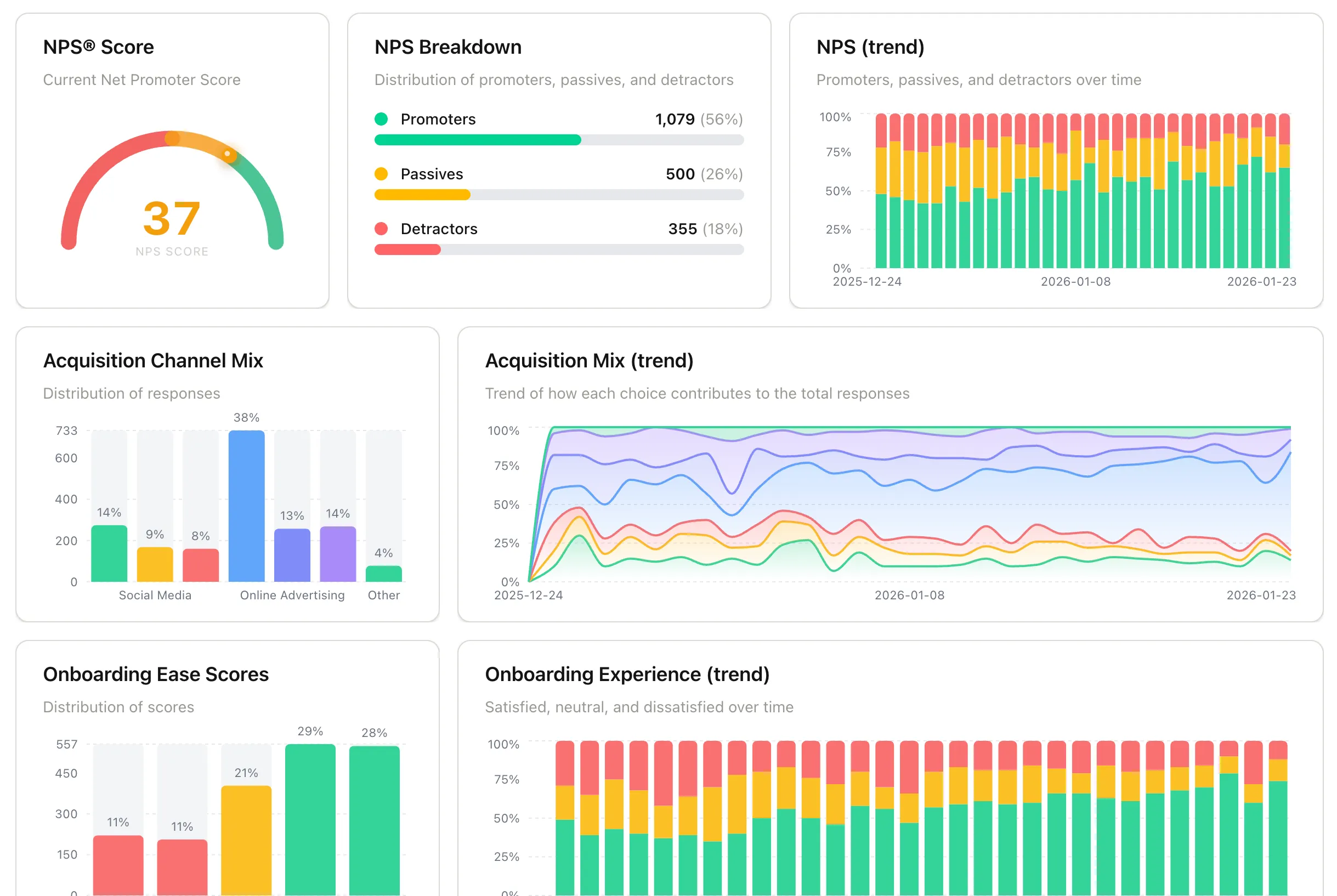
SaaS Feedback Pack Insights Dashboard using Pulseahead
Each chart is useful on its own. The real value shows up when you read them together.
Your NPS score starts declining this quarter. You pull up the onboarding ease scores from the cohort that signed up three months ago, roughly when these users were going through onboarding. Those scores are lower than the previous cohort. Something changed in onboarding that is now surfacing in long-term sentiment. You would not have made that connection if the data lived in separate tools.
Your churn is higher this month. You look at activation confidence data from users who signed up six to eight weeks ago. A higher share than usual reported still figuring it out at that stage. The churn you are seeing now was already visible in the activation data weeks earlier.
Individual surveys give you data points. Surveys in context give you causality. That is what makes keeping your lifecycle surveys in one place worth doing.
There is a 14-day free trial with no credit card required. If you have been putting off building out a feedback system, this is the version that actually gets done.
All 6 lifecycle surveys, pre-built and ready to launch.