Overview
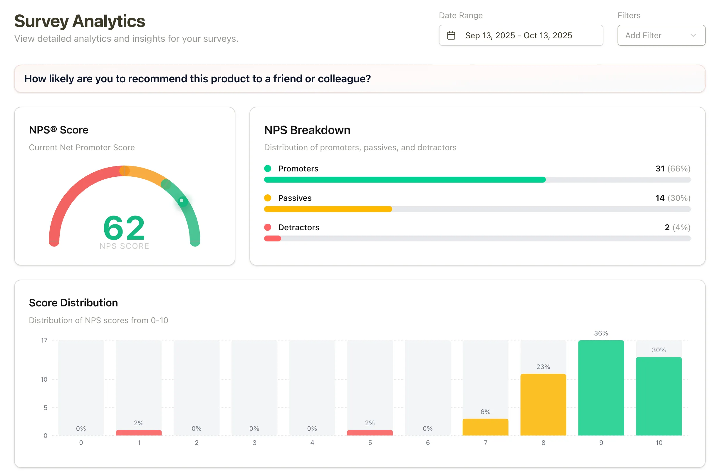
A clearer, faster way to understand feedback. The new Analytics Dashboard surfaces key NPS metrics, adds flexible date ranges, and introduces charts to spot trends and drop-offs.
What’s New
- At-a-glance metrics: Overall NPS, completions, and key counts in one view.
- Date range filtering: Focus analyses on the period that matters.
- Visual charts: Distribution and trend charts to see movement over time.
- Funnel trend chart: Track how many users were shown the survey vs how many responses were received over time.
Improvements
- Layout and spacing updates for readability.
- Performance and loading tweaks for faster insights.
Feedback? Tell us from the Analytics page or via in-app chat.