Building a feature is the easy part. Shipping it is harder. But knowing whether it actually worked? That’s where most teams fall apart. A product manager releases a feature with fanfare, users click around for a week, and then everyone moves on to the next thing. Three months later, no one can answer the most basic question: did this feature move the needle? The silence in that room is deafening because the honest answer is nobody knows.
This isn’t just a measurement problem. It’s a business problem. Teams that can’t measure feature success end up repeating the same mistakes, wasting resources on features nobody uses, and missing the signals that predict real adoption. This guide cuts through the noise and shows you exactly what to measure, when to measure it, and how to act on what you find.
The Real Cost of Guessing on Feature Success
Before diving into metrics, let’s be clear about why this matters. On Reddit and Quora, product managers consistently surface the same frustration: they launch features with conviction, but conviction isn’t data. The gap between “we think this is valuable” and “users actually find it valuable” is where opportunity gets wasted.
The problem starts early. Most teams define success metrics in the feature spec, write something vague about adoption or engagement, and then never look at those numbers again. By launch retrospective time, nobody remembers what success was supposed to look like. Everyone has moved on to the next sprint. This cycle repeats. Metrics become theater, not tools.
Here’s what this costs you: wasted engineering effort, confused messaging to users, and worst of all, missed signals about what users actually need. When you can’t measure success, you can’t learn from failure. You can’t iterate with conviction. You’re just guessing, feature after feature, quarter after quarter.
The teams that break this cycle do one thing differently. They measure the right things, at the right time, in a way that’s actually actionable. Not for executive reports. For decision-making.
Stop guessing on feature success. Get the data you need.
The Adoption Myth: Why High Engagement Doesn’t Mean Success
Here’s where most teams go wrong: they confuse adoption with success. “30% of users tried the feature” sounds great until you realize “tried” might mean a single click out of curiosity. Real adoption is different. Real adoption means users come back, integrate the feature into their workflow, and stick around because of it.
This distinction matters because it changes how you measure. If you’re tracking whether someone tried a feature, you’re measuring awareness or discoverability. That’s useful, but it’s not the same as measuring whether the feature creates lasting value. A feature can have high trial rates and still fail spectacularly because users don’t see value after that first click.
The equation product teams need to embrace is simple but critical: Adoption multiplied by value equals feature success. You can have perfect awareness (everyone knows about the feature), but if nobody sees value in it, adoption will collapse. You can have genuinely useful functionality buried so deep that nobody finds it. Both lead to failure, but for different reasons. Measurement needs to separate these signals.
This is why the most successful SaaS teams track adoption in layers.
- First layer: awareness and discoverability. Does the user even know the feature exists?
- Second layer: activation. Did they try it and understand what it does?
- Third layer: usage. Are they coming back?
- Fourth layer: value realization. Is it changing their behavior or solving a problem?
Each layer requires different metrics and different interventions. Most teams only track the first layer and call it done. That’s the mistake.
The Four Metrics That Actually Matter
Forget trying to track twenty things. Focus on four core metrics that, when measured consistently, reveal the real story of your feature’s impact.
1. Feature Adoption Rate: The Starting Signal
Feature adoption rate answers a basic question: what percentage of your active users are actually using this feature? The formula is straightforward: divide monthly active users who interacted with the feature by total active users during the same period, then multiply by 100. Most SaaS products see average adoption rates around 24.5%, which means three-quarters of users never interact with most features.
This metric is a starting signal, not an ending one. If your adoption rate is 5%, you have a problem. But is it a feature problem, a discovery problem, or a messaging problem? Adoption rate alone won’t tell you. But it will tell you something is broken and needs investigation. High adoption rates (above 30-35% for most features) suggest your onboarding and messaging are working. Low rates suggest friction somewhere in the user journey.
The key is tracking adoption by cohort and segment. New users might adopt at a different rate than power users. Enterprise customers might adopt faster than SMBs. Free users might adopt a feature differently than paid users. Breaking adoption down by segment reveals where it’s working and where it isn’t.
2. Drop-Off Rate: The Friction Detector
Drop-off rate is the percentage of users who activate a feature but never use it again. It’s the feature graveyard metric. A user tried it once, didn’t feel value immediately, and ghosted. This metric catches the gap between “aware” and “sticky”.
To calculate it, track users who complete an onboarding or first interaction with the feature, then measure what percentage of those users return for a second interaction within a specified timeframe (usually 7 or 30 days). High drop-off rates (above 60-70%) suggest the first experience isn’t convincing enough. Users don’t immediately see value, or the feature doesn’t fit their workflow, or they got confused using it.
The intelligence here isn’t in the number itself. It’s in investigating why users are dropping off. This is where qualitative feedback becomes critical. After users drop off, ask them directly: “What would make you use this feature more often?” Their answers point you toward either better onboarding, feature redesign, or a fundamental mismatch between what you built and what they need.
3. Net Promoter Score (NPS) and Customer Satisfaction: The Sentiment Layer
Adoption and drop-off tell you what users are doing. NPS and CSAT tell you how they feel about it. Two features can have identical adoption rates but wildly different NPS scores. One delights users. One frustrates them despite being used.
NPS asks a simple question: on a scale of 0-10, how likely are you to recommend this feature to a colleague? Scores 9-10 are promoters. Scores 0-6 are detractors. Score is (% Promoters) minus (% Detractors). An NPS of 30+ is considered good. Above 50+ is exceptional.
The magic is in the follow-up. After scoring, ask “why?” Promoters tell you what’s working. Detractors tell you exactly where friction lives. Pattern-match across dozens of responses, and you’ll spot the real issues. Three detractors mention the same problem, and you know where to focus next. This turns sentiment from vanity into direction.
Send NPS or CSAT surveys contextually, meaning right after users interact with the feature. In-app surveys get 3-5x higher response rates than email because users respond in the moment with fresh context. A user just finished using the feature, so they can answer accurately. With tools like Pulseahead, you can use pre-built NPS survey or CSAT survey templates to trigger these questions at the perfect moment without any engineering effort.
4. Recurring Usage: The Adoption Proof
The ultimate test: do users come back? Recurring usage tracks what percentage of users who adopted the feature actually use it more than once within a measured period. If adoption rate is 40% but recurring usage is only 10%, you have an awareness problem that turned into a stickiness problem.
Track this by looking at users who had multiple interactions with the feature across different sessions or time periods. A user might use the feature on Monday and Friday. That’s recurring usage. A user who tries it once and never returns? That’s novelty, not adoption.
The benchmark for “good” recurring usage varies wildly by feature type. A daily-use feature like task creation should see high recurring usage within 7 days. A monthly-use feature like report export might have a 30-day recurring usage window. Set your benchmark based on how frequently users should use the feature if it’s truly valuable to them, not based on industry standards for unrelated products.
Track adoption, drop-off, and NPS in one place. Start now.
Beyond the Metrics: Creating Your Feature Success Dashboard
Metrics are useless if nobody looks at them. Create a simple dashboard that surfaces the metrics that matter. Weekly. Make it visible to your product, engineering, and customer success teams. This transforms measurement from an annual exercise into a continuous conversation.
Your dashboard should show:
Adoption rate by cohort (new users vs. existing users) Drop-off funnel (% activated, % used, % used again) NPS or CSAT trend line with recent detractor feedback highlighted Recurring usage rate with a clear benchmark line
Add contextual notes below each metric. Why did adoption spike on day 3? Did you run a launch webinar? Why did NPS drop to 35 last week? Did you push an update that broke something? This narrative transforms numbers into decisions.
Update it weekly, not monthly. Feature success is determined in the first 2-3 weeks post-launch. By the time you see monthly trends, it’s too late to course-correct on messaging or onboarding. Weekly dashboards catch problems early.
The Question That Changes Everything: Get Direct Feedback
Here’s the difference between teams that move the needle and teams that don’t: the former close the loop with direct user feedback.
After users interact with your feature, ask them three questions that matter. These aren’t designed to make you feel good. They’re designed to reveal exactly what’s working and what’s not:
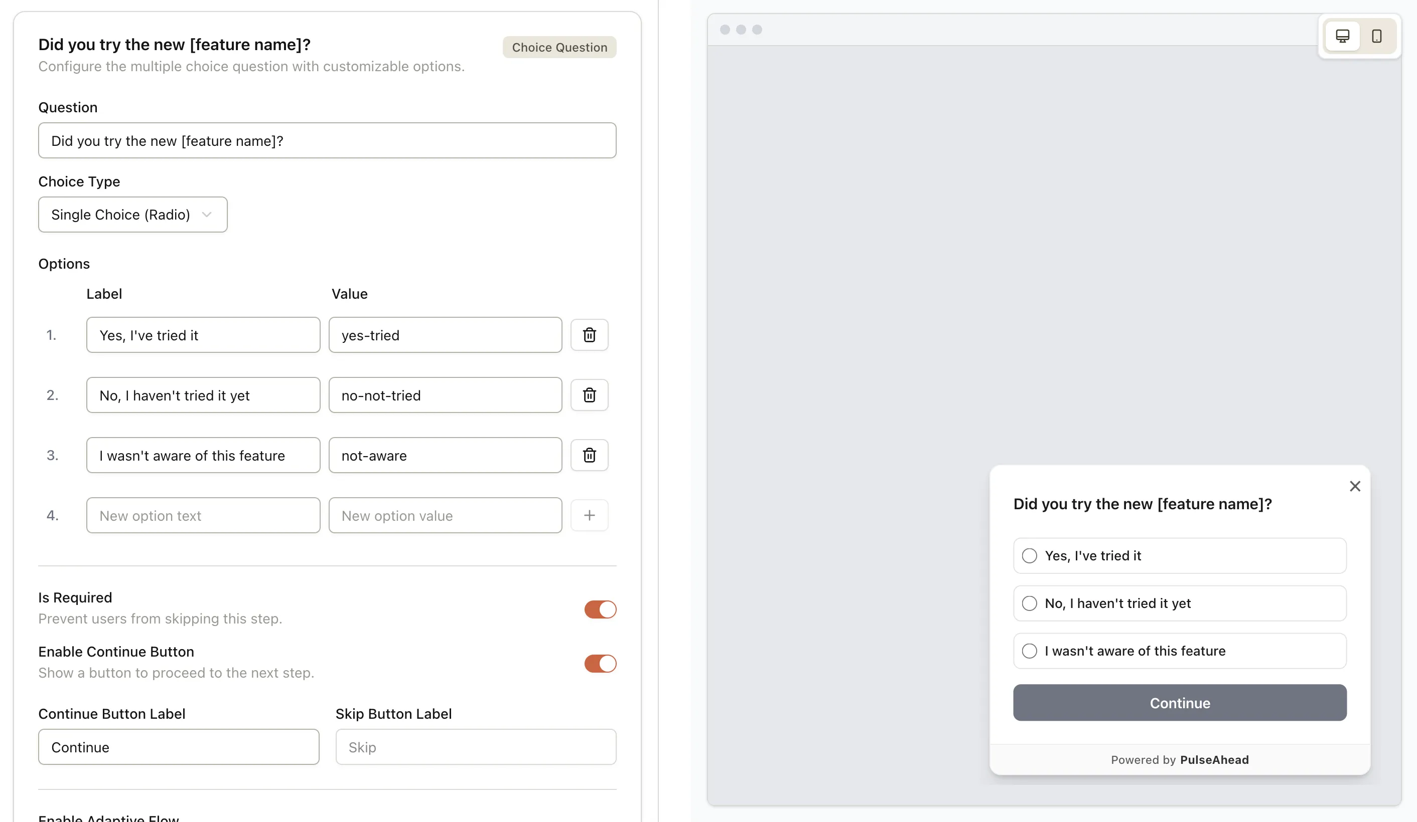
- “Did you try the new [feature name]?” This tells you whether your discovery is working. If 40% say no, you have a visibility problem.
- “How useful is it for you?” This measures perceived value. A scale of 1-5 works well. Complement it with “What could make it more useful?” Their answer is often your next sprint.
- “What could make it better?” Open-ended feedback from real users beats design assumptions every single time.
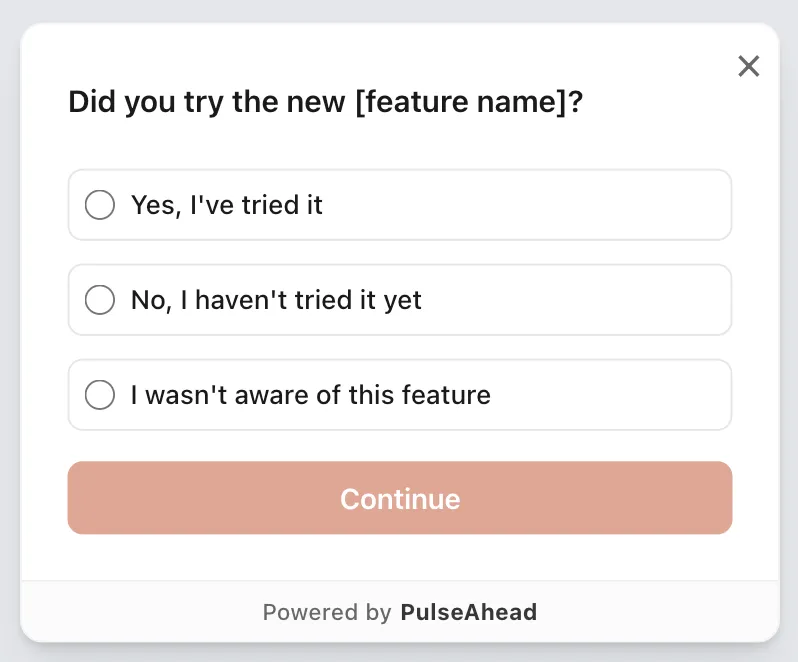
New Feature Feedback Survey Example using Pulseahead
These aren’t survey questions you send out and forget about. Build them into your feature workflows. Trigger them contextually using in-app surveys, when users are actively engaging with the feature. Ask within minutes of use, not days later. Context is everything.
Pulseahead is designed for this. It allows you to embed a release feedback survey directly into your product, trigger them at the exact moment of use, and instantly see patterns across responses. You don’t need to wade through raw feedback manually. The analytics dashboard surfaces themes automatically: top pain points, feature requests, and wins. This transforms feedback collection from a nice-to-have into a scalable system that informs real decisions.
The Trap: Measuring Without Acting
Here’s where most measurement systems fail: they measure, but they don’t act. Data sits in dashboards. Feedback piles up in spreadsheets. And nothing changes.
The teams that succeed measure specifically to make decisions. If your feature adoption drops below 20%, you have a decision: redesign the onboarding, adjust the messaging, or kill the feature. If NPS drops to 25, you have a decision: pause other work and fix the critical issue, or accept that you’re shipping something broken and let it churn.
This requires two things. First, decide in advance what each metric tells you and what you’ll do if it hits certain thresholds. If adoption doesn’t hit 25% by day 7, we’ll revise the launch messaging. If NPS is below 30, we hold a post-mortem on day 10. If recurring usage is below 15%, we schedule a sprint to address the top detractor feedback. Set these thresholds before launch, when you’re not defensive about the work.
Second, communicate back to users what changed because of their feedback. This seems small, but it’s huge. When users see that their feedback led to action, they become invested in your product’s success. They respond to future surveys. They give better feedback. They stay longer. Research shows customers are 21% more likely to respond to your next survey when they see their input led to a specific improvement.
The Foundation: Setting Success Before Launch
The best measurement systems start before you ship anything. Before launch, define:
What problem does this feature solve? What behavior should change if we’re successful? What metric will we measure to know if that behavior has actually changed?
This isn’t one metric. It’s usually three: one adoption metric, one value metric, and one defensive metric to make sure you’re not breaking other parts of the product. For example, rolling out a bulk email feature might track: adoption rate (percentage of users who send a bulk email in the first month), time saved (how many hours per week users save using this vs. manual emails), and churn impact (do teams using bulk email stay longer than teams that don’t).
If you can’t articulate before launch what success looks like, you won’t recognize it when it arrives. And worse, you’ll build features quarter after quarter without ever knowing if any of them worked.
Measuring Beyond Launch: It’s Not Binary
Feature success isn’t a binary state. It’s not launch day. Your feature doesn’t succeed or fail. It evolves. The teams that understand this ship features that get better over time. Those that don’t ship features that get stale and ignored.
Commit to measuring your feature for at least 3 months post-launch. Week 1 tells you about discovery and first impressions. Week 2-3 tells you about the first experience and whether users return. Month 2-3 tells you whether adoption becomes a habit or dies out. Each phase reveals different things and requires different actions.
If adoption isn’t happening by month 2, stop trying to save it. Deprioritize it, remove it from the roadmap, or rebuild it based on what you learned. Chasing a failed feature is how teams waste resources. Measuring it means you can admit failure fast, extract what you learned, and move on.
Use Pulseahead to quickly build and customize your release feedback survey with ease
From Measurement to Momentum
The teams moving the needle on new features aren’t the ones shipping fast. They’re the ones measuring thoughtfully. They ship a feature, measure adoption and sentiment within days, act on what they learn, and iterate weekly. After a month, they know whether they solved a real problem or missed the mark. After a quarter, they know which features drive retention and which ones people ignore.
This requires discipline. Most teams would rather ship something new than measure what they shipped. Velocity looks good. Roadmaps look packed. But at the end of the quarter, retention is flat and churn is up. That’s what happens when you confuse output with outcomes.
Start measuring your next feature release using the framework in this guide. Set your metrics before launch. Collect feedback contextually using in-product surveys. Update your dashboard weekly. Act on what you find. Then measure again. The data won’t lie. Your feature either moved the needle or it didn’t. You’ll finally know which. And with a tool like Pulseahead, you can automate the entire feedback loop, from survey creation to analysis, turning this powerful framework into a seamless part of your workflow.